
Verbit provides customers with a captioning service for their live broadcast events and sessions, delivered with elite precision by voice captioners (re-speakers). In support of scaling and expanding this high-end service, we developed Echo, a professional dictation tool.
As the UX designer for Echo, I played a pivotal role from the discovery stage to the planning and design phases, overseeing its evolution from Beta version MVP to its successful production launch. Leading two dedicated research rounds involving UX research, Data Science, and Quality teams, I initiated an ongoing collaborative workflow with design partners. Additionally, I conducted UX interviews with captioners, ensuring a user-centric approach and collaborated with development teams integral to the product's success
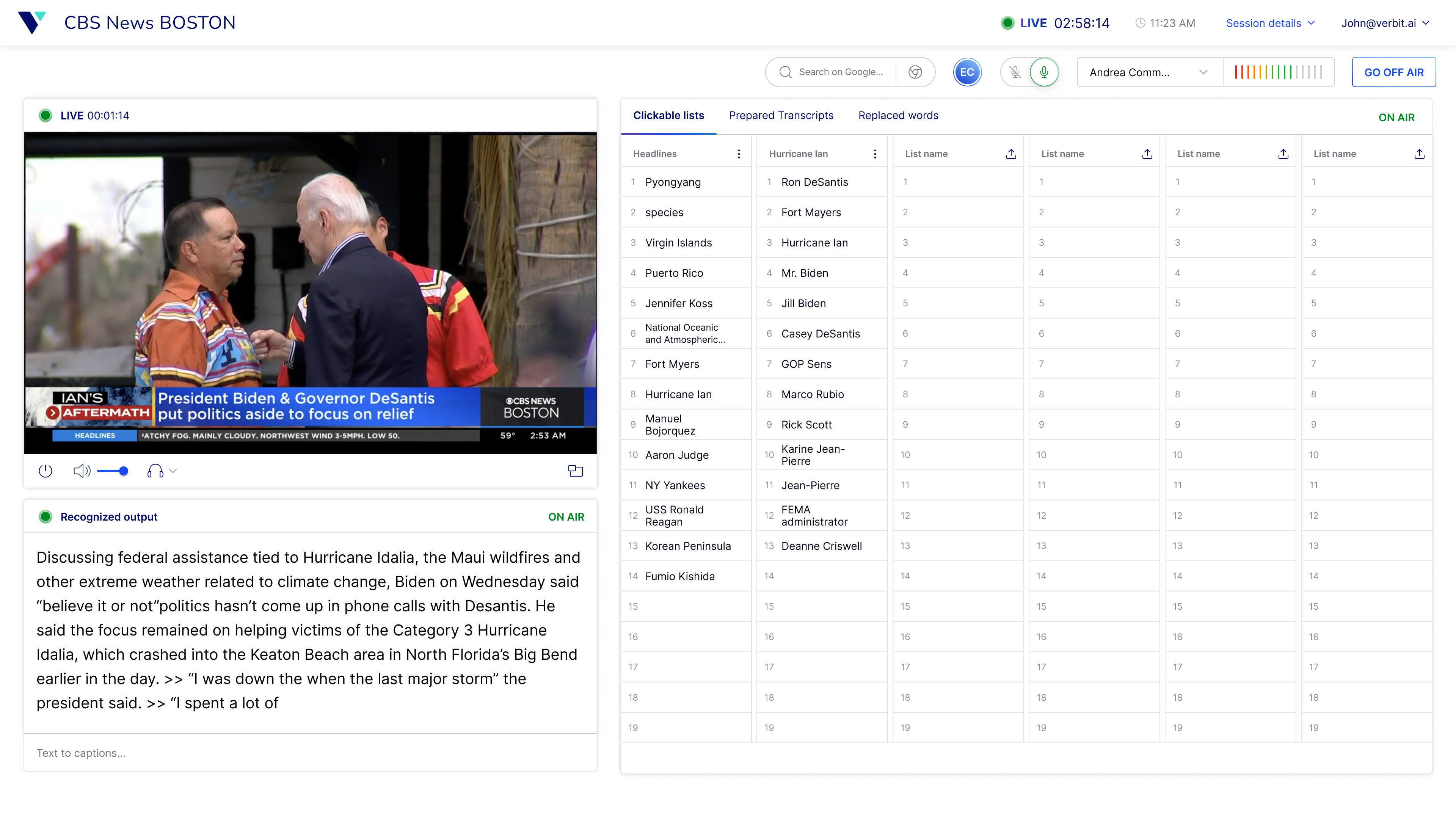
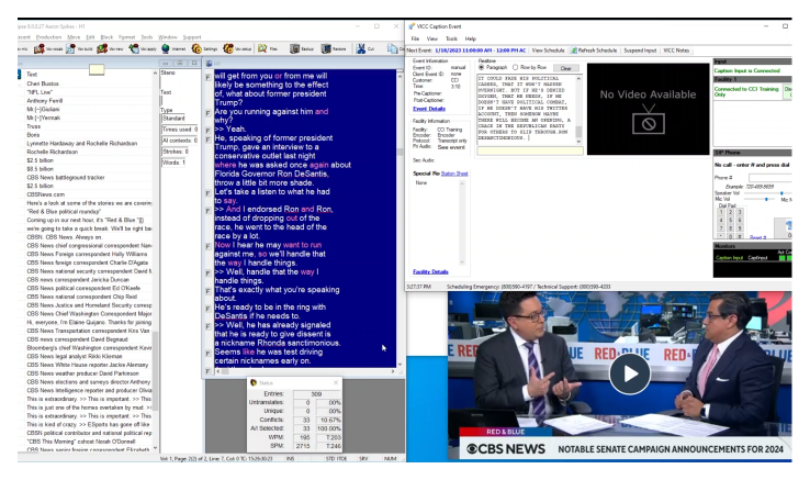
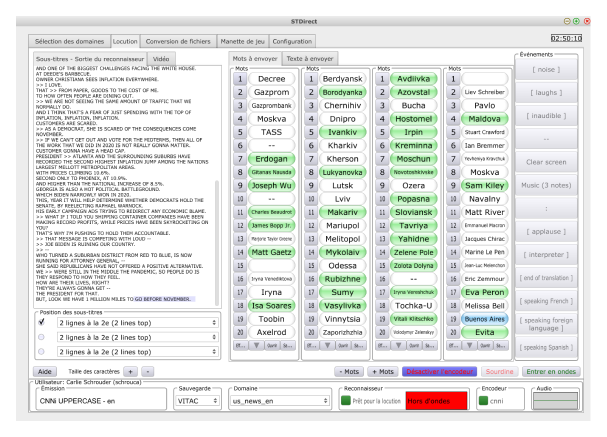
Our mission was clear: create a new system for live broadcast captioners, ensuring that we maintained the current quality of captions while reducing cognitive load and minimizing errors. The initial concept aimed to replicate the existing Canadian workflow, prioritizing accessibility, particularly for color blindness, and focusing on user-centric design. Our goal was to keep the system familiar yet innovative, easing the transition for captioners.
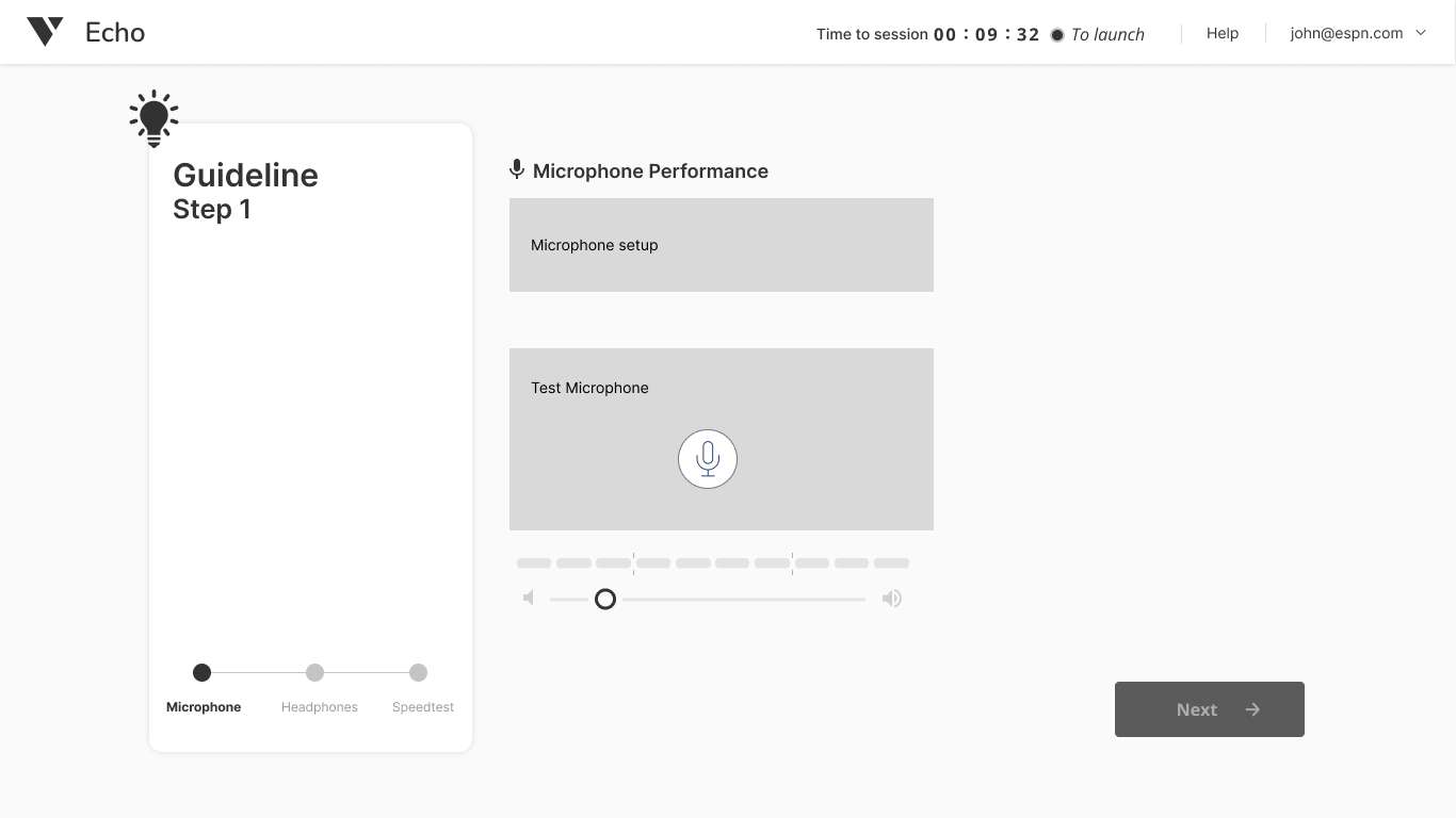
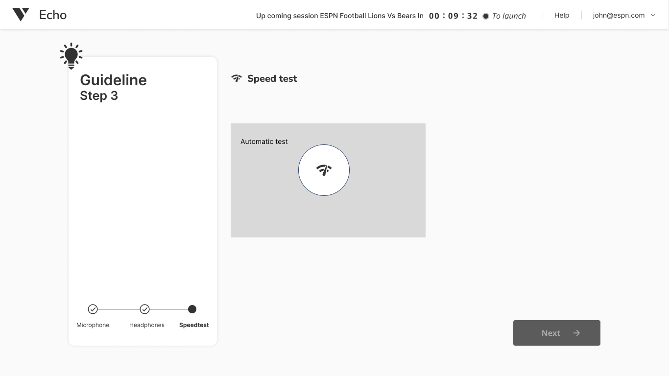
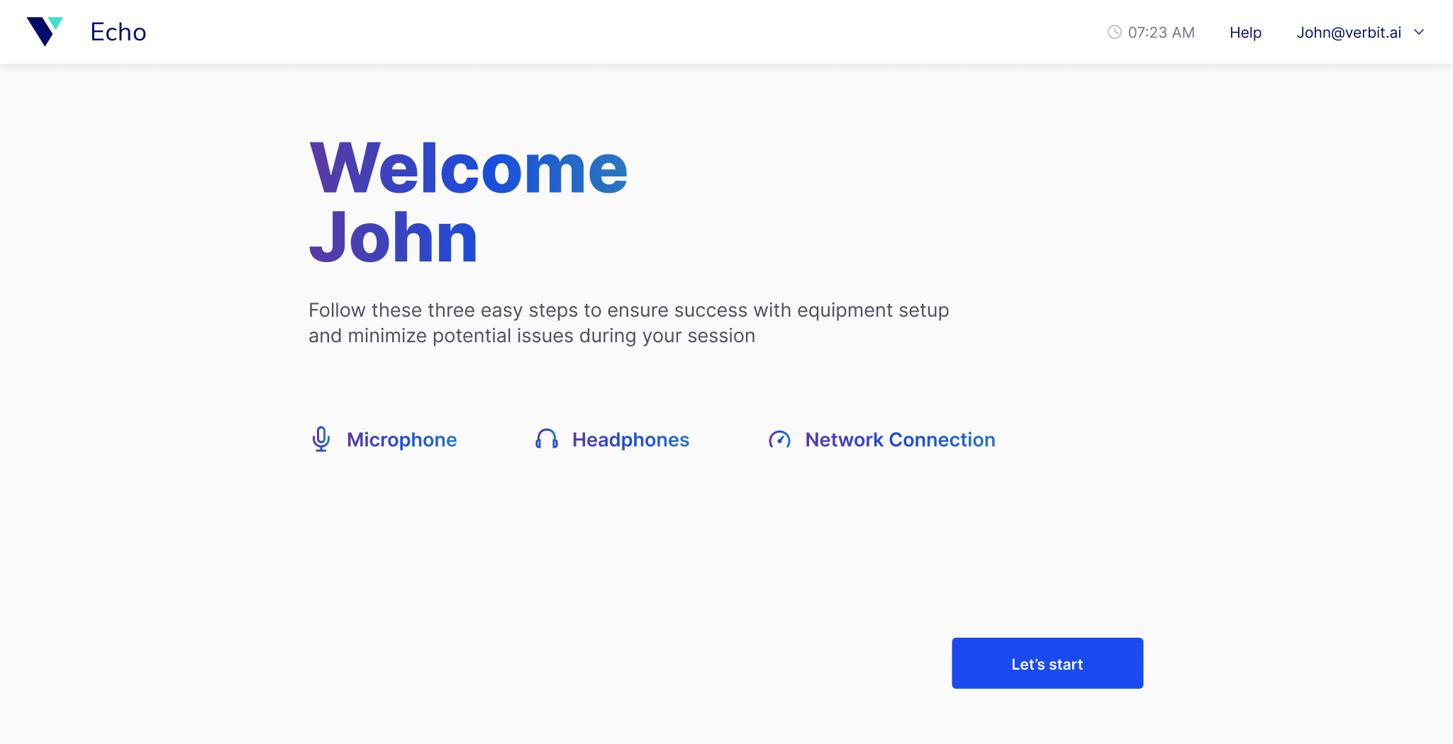
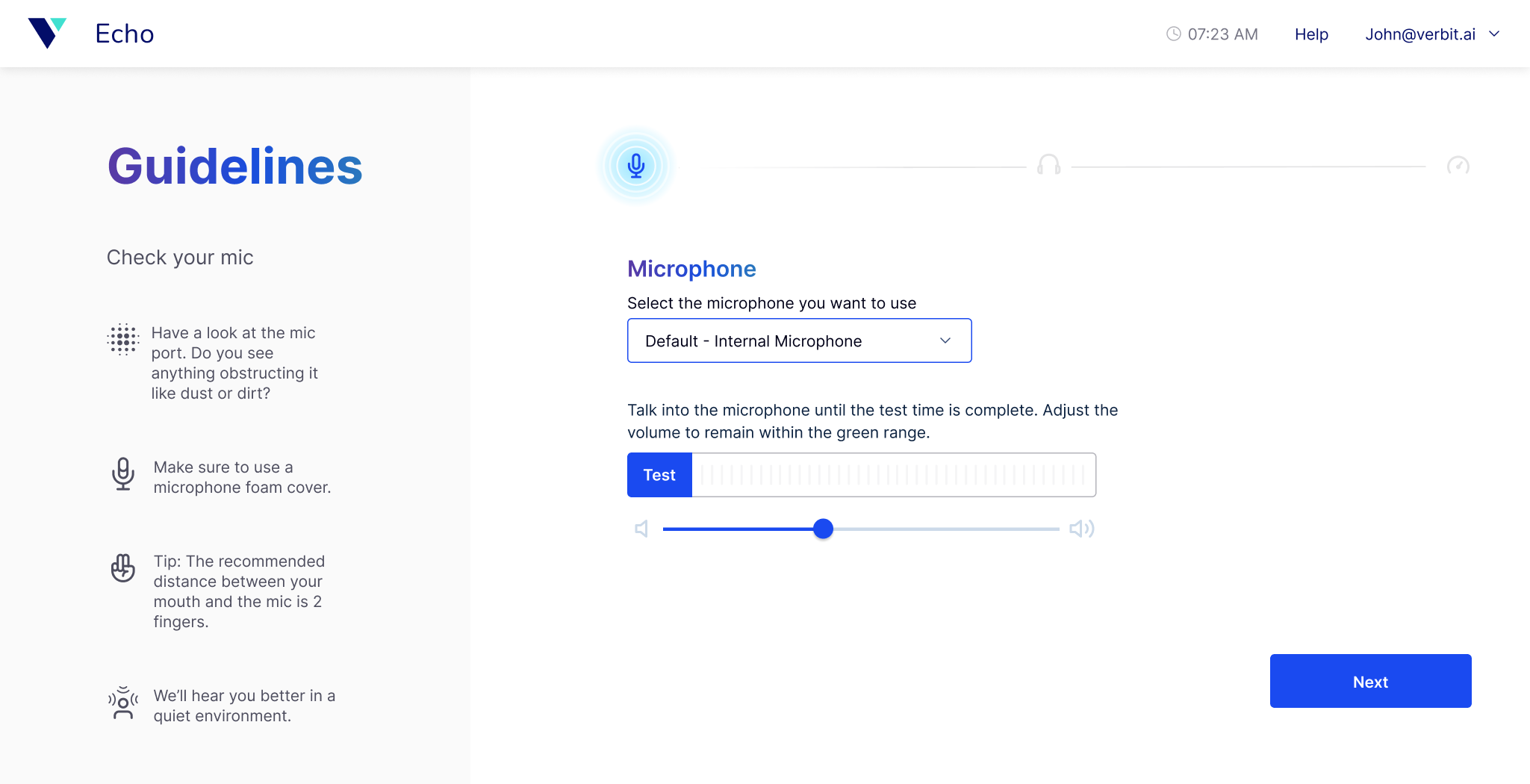
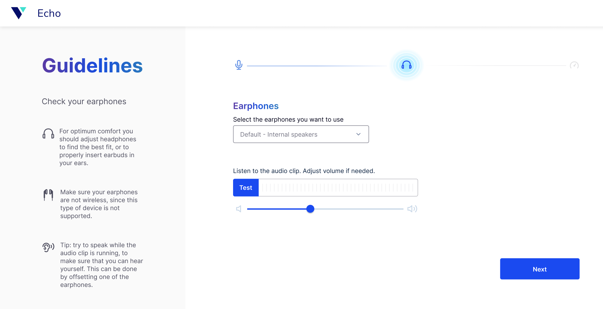
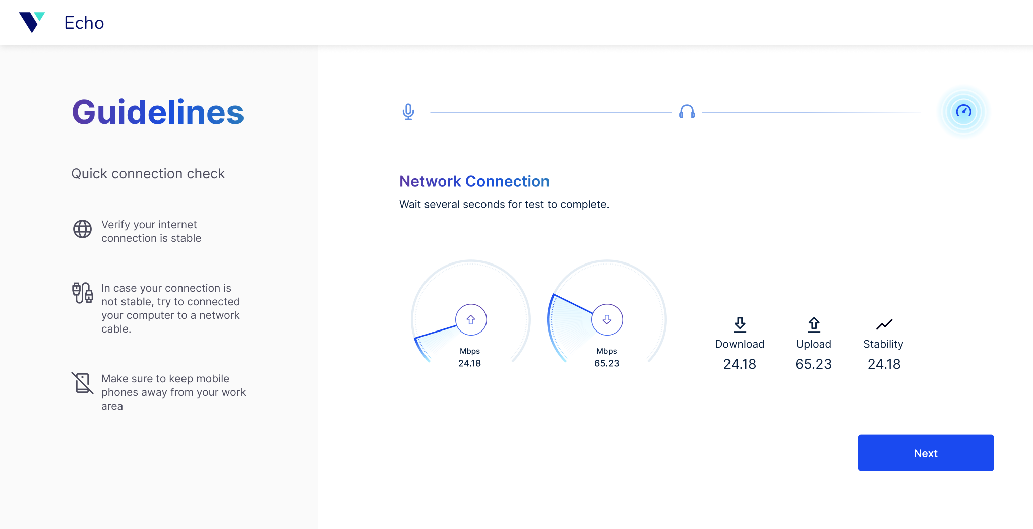
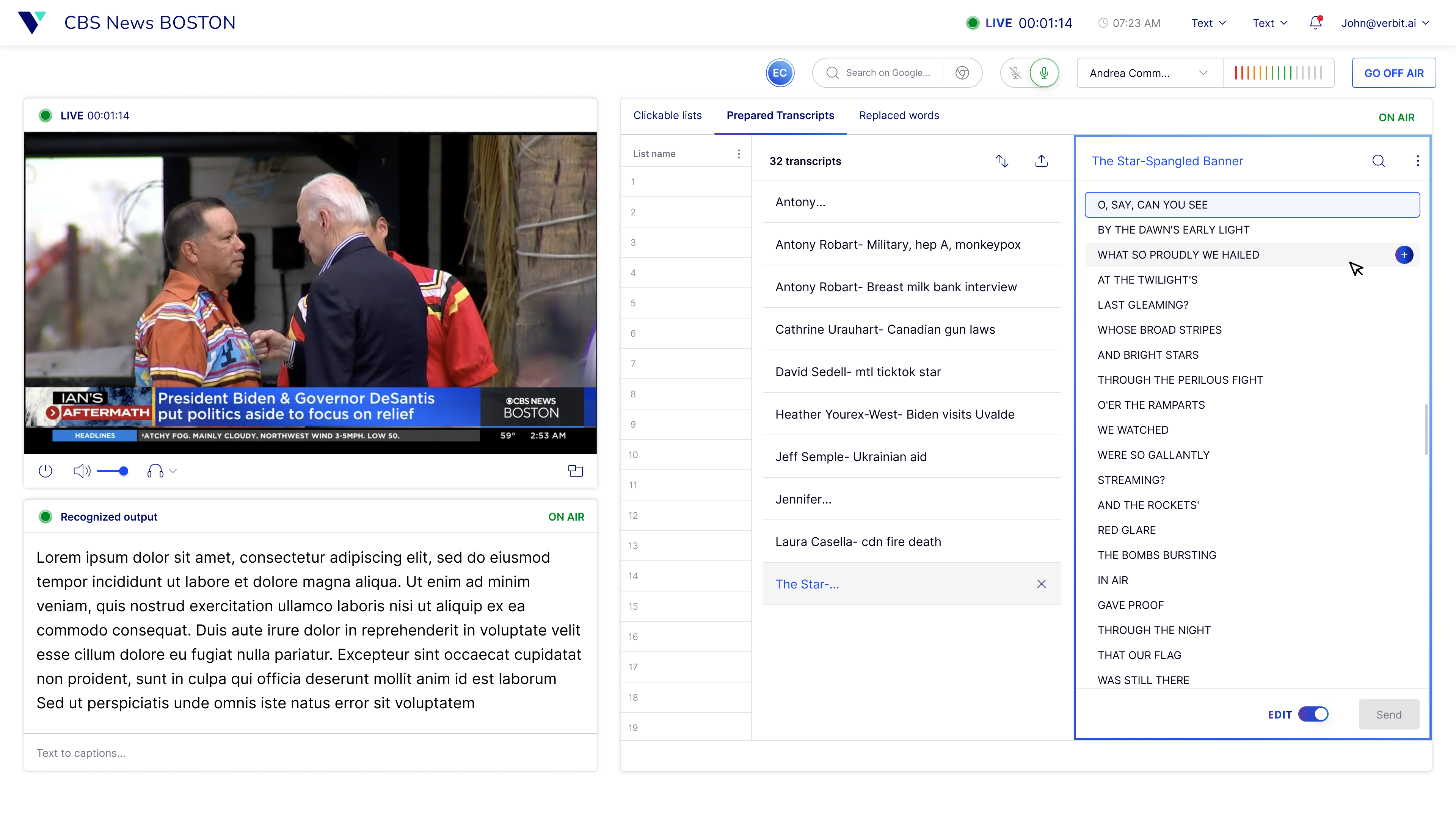
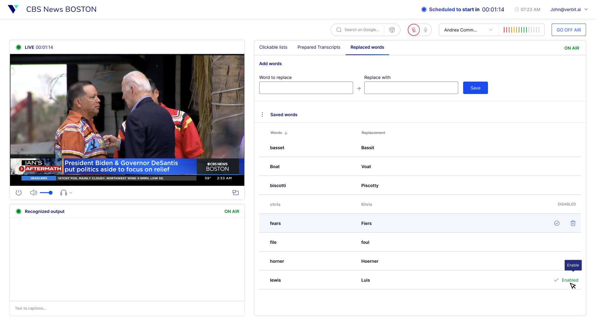
Onboarding had to be quick and straightforward, considering it would be different from what captioners were used to. We needed to ensure they could handle technical issues seamlessly. The main screen posed its own challenges: a new system and workspace could lead to fear and hesitation, potentially affecting the quality of their work. Our solution was to keep the design static and within the fold to avoid scrolling or navigating, ensuring a silent UI for quick visibility and minimal visual load.
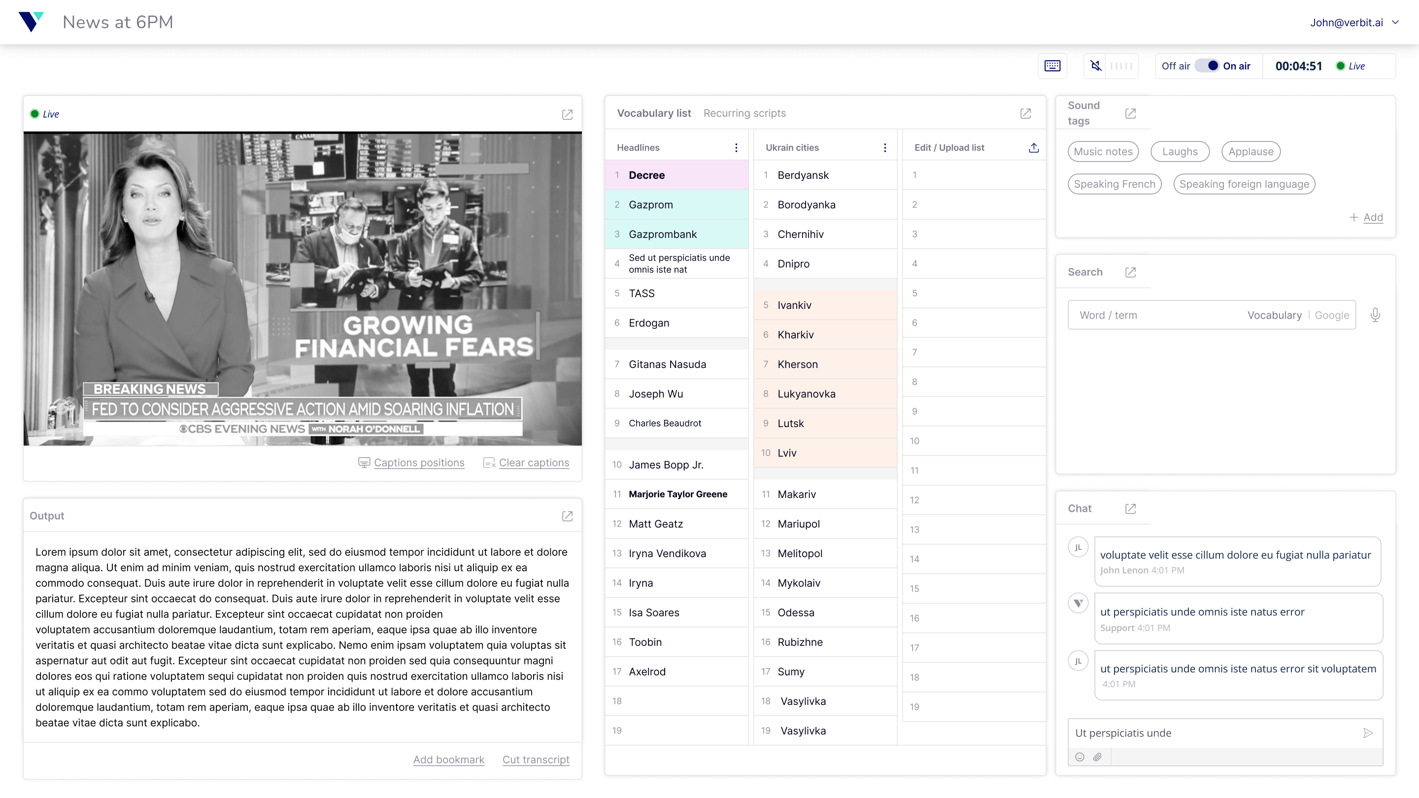
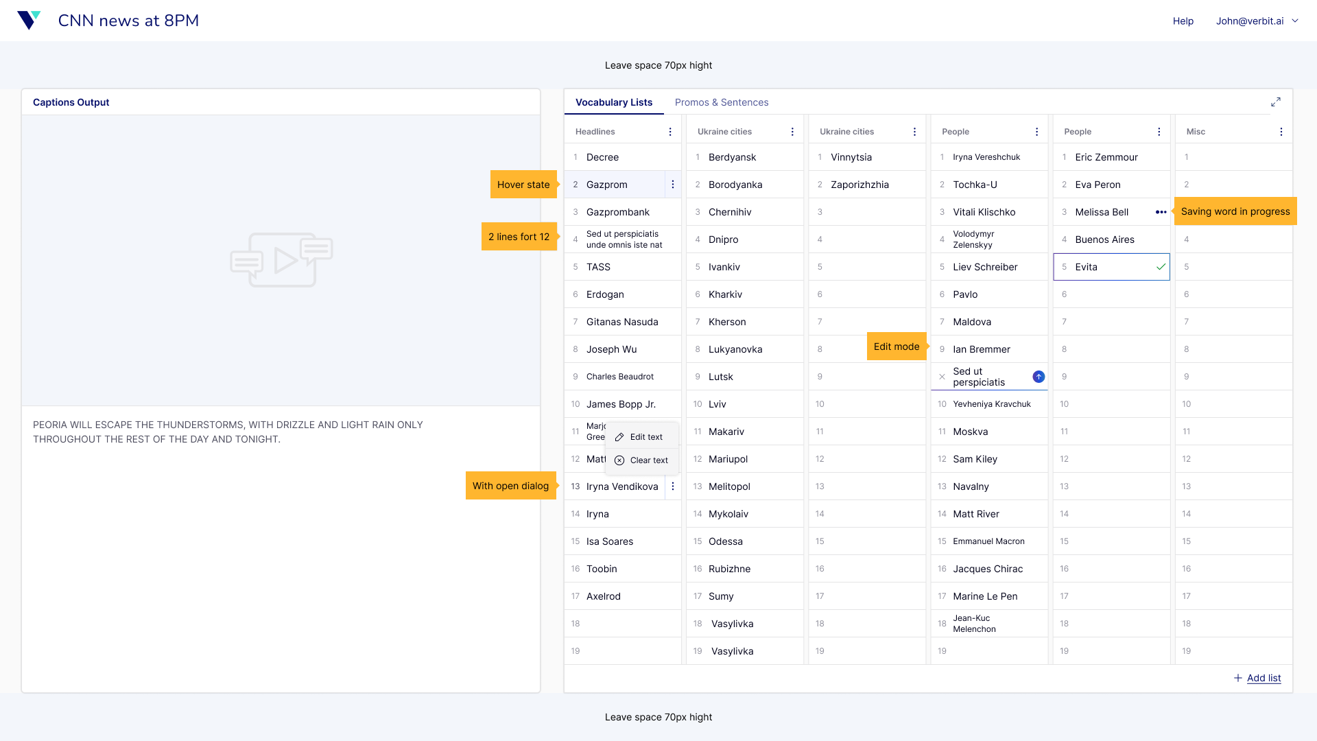
We delved into the specifics of our design, focusing on the fastest ways to navigate, add, edit, remove, and send terms to the transcript. The interplay between mouse, keyboard, and controller was critical, as we depended on hardware connected to the system. Balancing functionality and visibility with avoiding visual overload was key. Every change was tested rigorously to ensure it met our high standards.
Our team embarked on the ‘Wasach’ trip, visiting both sites to present our project, Echo. We met with management and captioners, conducted interviews and discussed future plans. The goal was to build relationships, gain buy-in, and understand specific workflow needs. Our first research phase aimed to evaluate if the new UI supported the same quality of work as existing systems, assessing user experience, satisfaction, usability, and pain points.
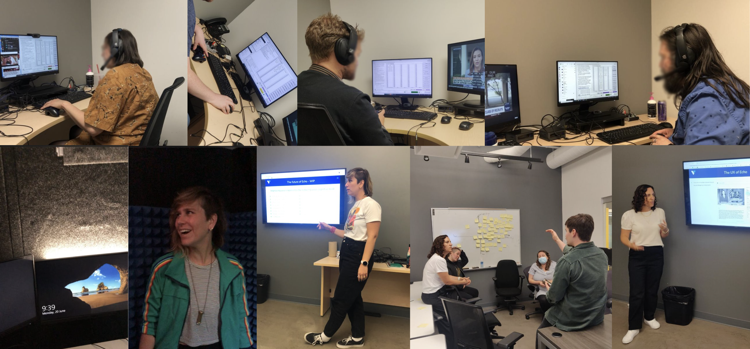
Progressing towards our MVP, we continued with short iterations and frequent testing. Weekly meetings with research, speech engineering and stakeholders ensured everyone was aligned. Our second research phase involved testing over 200 sessions across two sites for two weeks, closely analyzing results with the UXR. With the extensive testing and collaboration, we finally got the green light for GO LIVE, marking a significant milestone in our project.
Echo’s journey from concept to reality was a story of collaboration, innovation, and meticulous design. By focusing on the needs of the captioners and ensuring every change was user-tested, we created a system that not only maintained but enhanced their workflow. This project stands as a testament to the power of user-centered design and the importance of continuous feedback and iteration.